Loading packages and importing data
:: p_load (tidyverse, FunnelPlotR, plotly, knitr)<- read_csv ("data/COVID-19_DKI_Jakarta.csv" ) %>% mutate_if (is.character, as.factor)
Rows: 267 Columns: 7
── Column specification ────────────────────────────────────────────────────────
Delimiter: ","
chr (3): City, District, Sub-district
dbl (4): Sub-district ID, Positive, Recovered, Death

ℹ Use `spec()` to retrieve the full column specification for this data.
ℹ Specify the column types or set `show_col_types = FALSE` to quiet this message.
# A tibble: 267 × 7
`Sub-district ID` City District Sub-d…¹ Posit…² Recov…³ Death
<dbl> <fct> <fct> <fct> <dbl> <dbl> <dbl>
1 3172051003 JAKARTA UTARA PADEMANGAN ANCOL 1776 1691 26
2 3173041007 JAKARTA BARAT TAMBORA ANGKE 1783 1720 29
3 3175041005 JAKARTA TIMUR KRAMAT JATI BALE K… 2049 1964 31
4 3175031003 JAKARTA TIMUR JATINEGARA BALI M… 827 797 13
5 3175101006 JAKARTA TIMUR CIPAYUNG BAMBU … 2866 2792 27
6 3174031002 JAKARTA SELATAN MAMPANG PRAP… BANGKA 1828 1757 26
7 3175051002 JAKARTA TIMUR PASAR REBO BARU 2541 2433 37
8 3175041004 JAKARTA TIMUR KRAMAT JATI BATU A… 3608 3445 68
9 3171071002 JAKARTA PUSAT TANAH ABANG BENDUN… 2012 1937 38
10 3175031002 JAKARTA TIMUR JATINEGARA BIDARA… 2900 2773 52
# … with 257 more rows, and abbreviated variable names ¹`Sub-district`,
# ²Positive, ³Recovered
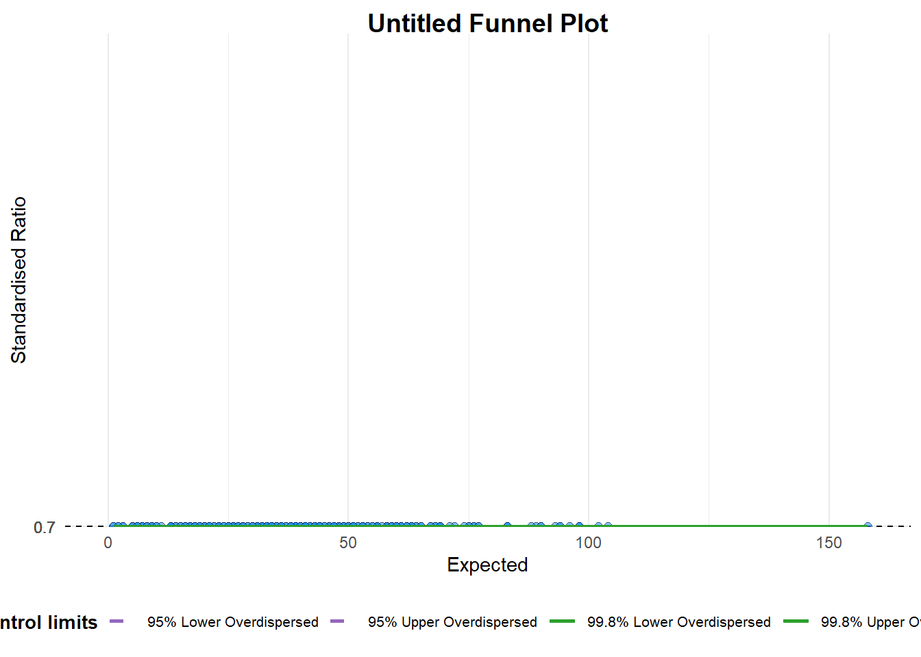
Basic funnel plot.
funnel_plot (numerator = covid19$ Positive,denominator = covid19$ Death,group = covid19$ ` Sub-district `
A funnel plot object with 267 points of which 0 are outliers.
Plot is adjusted for overdispersion.
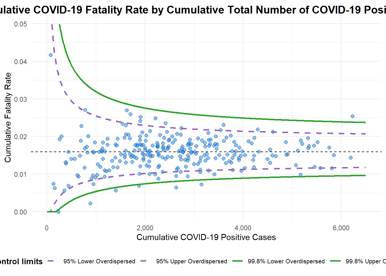
Made over by changing data type to proportions and recalibrating the x and y axes…
funnel_plot (numerator = covid19$ Death,denominator = covid19$ Positive,group = covid19$ ` Sub-district ` ,data_type = "PR" , xrange = c (0 , 6500 ), yrange = c (0 , 0.05 ),label = NA ,title = "Cumulative COVID-19 Fatality Rate by Cumulative Total Number of COVID-19 Positive Cases" , #<< x_label = "Cumulative COVID-19 Positive Cases" , #<< y_label = "Cumulative Fatality Rate" #<<
Warning: The `xrange` argument deprecated; please use the `x_range` argument
instead.  For more options, see the help: `?funnel_plot`
Warning: The `yrange` argument deprecated; please use the `y_range` argument
instead.  For more options, see the help: `?funnel_plot`
A funnel plot object with 267 points of which 7 are outliers.
Plot is adjusted for overdispersion.
… with more appropriate labelling
funnel_plot (numerator = covid19$ Death,denominator = covid19$ Positive,group = covid19$ ` Sub-district ` ,data_type = "PR" , xrange = c (0 , 6500 ), yrange = c (0 , 0.05 ),label = NA ,title = "Cumulative COVID-19 Fatality Rate by Cumulative Total Number of COVID-19 Positive Cases" , #<< x_label = "Cumulative COVID-19 Positive Cases" , #<< y_label = "Cumulative Fatality Rate" #<<
Warning: The `xrange` argument deprecated; please use the `x_range` argument
instead.  For more options, see the help: `?funnel_plot`
Warning: The `yrange` argument deprecated; please use the `y_range` argument
instead.  For more options, see the help: `?funnel_plot`
A funnel plot object with 267 points of which 7 are outliers.
Plot is adjusted for overdispersion.
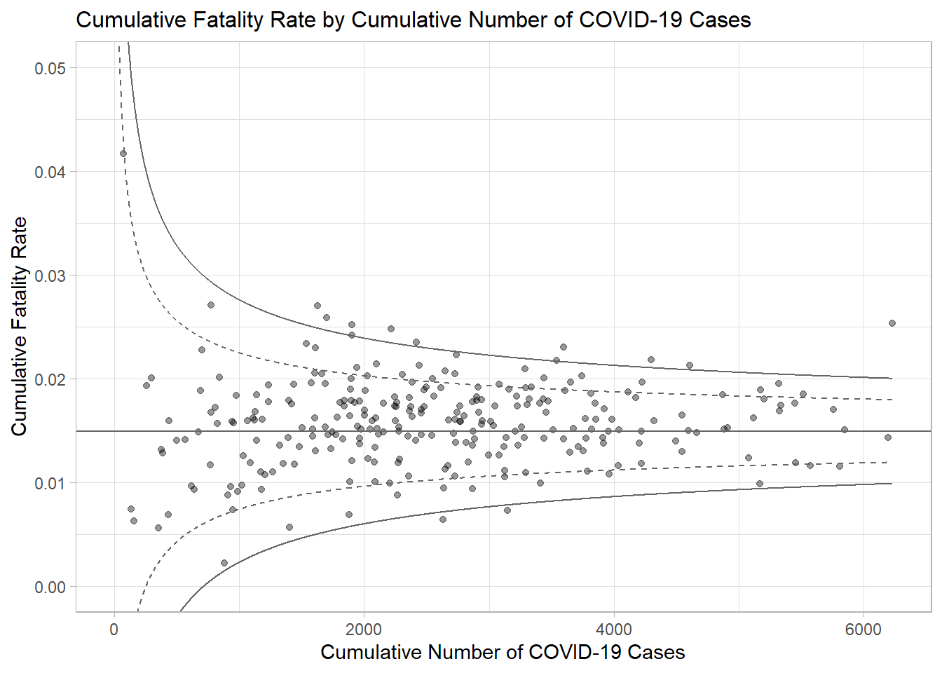
Funnel plots using ggplot2
First, derive cumulative death rate and its standard error.
<- covid19 %>% mutate (rate = Death / Positive) %>% mutate (rate.se = sqrt ((rate* (1 - rate)) / (Positive))) %>% filter (rate > 0 )
Compute fit.mean (what is?)
<- weighted.mean (df$ rate, 1 / df$ rate.se^ 2 )
Calculate the 95% and 99% confidence intervals
<- seq (1 , max (df$ Positive), 1 )<- fit.mean - 1.96 * sqrt ((fit.mean* (1 - fit.mean)) / (number.seq)) <- fit.mean + 1.96 * sqrt ((fit.mean* (1 - fit.mean)) / (number.seq)) <- fit.mean - 3.29 * sqrt ((fit.mean* (1 - fit.mean)) / (number.seq)) <- fit.mean + 3.29 * sqrt ((fit.mean* (1 - fit.mean)) / (number.seq)) <- data.frame (number.ll95, number.ul95, number.ll999, number.ul999, number.seq, fit.mean)
Plotting a static funnel plot (note that “label” is not recognised below, but is needed later for the interactive)
<- ggplot (df, aes (x = Positive, y = rate)) + geom_point (aes (label= ` Sub-district ` ), alpha= 0.4 ) + geom_line (data = dfCI, aes (x = number.seq, y = number.ll95), linewidth = 0.4 , colour = "grey40" , linetype = "dashed" ) + geom_line (data = dfCI, aes (x = number.seq, y = number.ul95), linewidth = 0.4 , colour = "grey40" , linetype = "dashed" ) + geom_line (data = dfCI, aes (x = number.seq, y = number.ll999), linewidth = 0.4 , colour = "grey40" ) + geom_line (data = dfCI, aes (x = number.seq, y = number.ul999), linewidth = 0.4 , colour = "grey40" ) + geom_hline (data = dfCI, aes (yintercept = fit.mean), linewidth = 0.4 , colour = "grey40" ) + coord_cartesian (ylim= c (0 ,0.05 )) + annotate ("text" , x = 1 , y = - 0.13 , label = "95%" , size = 3 , colour = "grey40" ) + annotate ("text" , x = 4.5 , y = - 0.18 , label = "99%" , size = 3 , colour = "grey40" ) + ggtitle ("Cumulative Fatality Rate by Cumulative Number of COVID-19 Cases" ) + xlab ("Cumulative Number of COVID-19 Cases" ) + ylab ("Cumulative Fatality Rate" ) + theme_light () + theme (plot.title = element_text (size= 12 ),legend.position = c (0.91 ,0.85 ), legend.title = element_text (size= 7 ),legend.text = element_text (size= 7 ),legend.background = element_rect (colour = "grey60" , linetype = "dotted" ),legend.key.height = unit (0.3 , "cm" ))
Warning in geom_point(aes(label = `Sub-district`), alpha = 0.4): Ignoring
unknown aesthetics: label
Making it interactive.
<- ggplotly (p,tooltip = c ("label" , "x" , "y" ))